The Psychology of Decoration: How Colors Affect Your Mood
Are you feeling stressed or unproductive in your own home? Have you ever noticed how the colors in your surroundings can affect your mood and emotions? In this blog post, we will explore the fascinating world of the psychology of decoration and how colors play a crucial role in shaping our mental and emotional well-being. From the science behind colors and mood to the impact of different color schemes on our happiness and positivity, we will delve into the power of warm, cool, neutral, bright, pastel, and contrasting colors in creating the atmosphere you desire. Join us as we uncover the secrets of the psychology of complementary colors in decor and how individual color preferences can influence our mood. By the end of this post, you’ll have a deeper understanding of how to use colors to create the perfect ambiance for any space in your home.
Introduction to the Psychology of Decoration
When it comes to decorating a space, it’s not just about arranging furniture and choosing the right accessories. The psychology of decoration goes much deeper than that, influencing our emotions, behaviors, and overall well-being. By understanding the psychological impact of decoration, we can create spaces that promote happiness, productivity, relaxation, and other desired moods.
Throughout history, humans have used decoration to express themselves, create a sense of belonging, and influence their own and others’ perceptions of their surroundings. From cave paintings and intricate tapestries to modern interior design, the way we decorate our spaces reflects our cultural values, personal tastes, and emotional needs.
Furthermore, studies have shown that visual stimuli have a direct effect on our mental and emotional states. This means that the colors, textures, patterns, and overall arrangement of decorations in a space can influence our mood, stress levels, energy levels, and other aspects of our psychological well-being.
As we explore the psychology of decoration in this blog series, we will delve into the science behind colors and mood, the effects of warm and cool colors on our emotions, the impact of bright colors on happiness, and much more. By gaining a better understanding of the psychological aspects of decoration, we can transform our living and working spaces into environments that support our mental and emotional health.
The Science Behind Colors and Mood
Colors have a powerful impact on our mood and emotions. The field of psychology has long studied the effects of different colors on human behavior and mental state. It’s fascinating to understand the science behind how colors can influence our mood and well-being.
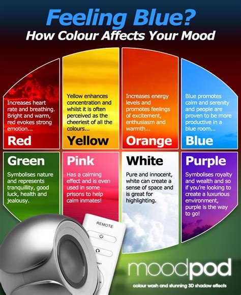
Research has shown that warm colors such as red, orange, and yellow can energize and stimulate the brain. These colors are often associated with warmth, energy, and passion. They have the ability to increase heart rate and create a sense of excitement and warmth.
Cool colors, on the other hand, such as blue, green, and purple, have a calming and relaxing effect on the mind. These colors are often used in spaces where relaxation and tranquility are desired, such as bedrooms and meditation rooms. They have the power to lower blood pressure and create a sense of serenity and peace.
Neutral colors like white, beige, and gray are known for creating a sense of balance and harmony. They can evoke feelings of stability and calmness, making them a popular choice for minimalist and modern interior designs.
How Warm Colors Energize and Stimulate
Warm colors such as red, orange, and yellow are known for their ability to energize and stimulate the mind and body. These colors are often associated with feelings of warmth, passion, and excitement, and can have a powerful impact on our mood and emotions.
When used in interior design, warm colors can create a sense of warmth and coziness in a space, making it feel inviting and vibrant. These colors can also increase the energy levels in a room, making it a great choice for areas where socializing and activity take place, such as living rooms and kitchens.
Psychologically, warm colors are thought to increase heart rate and blood pressure, as well as stimulate appetite and create a sense of urgency. They can also promote feelings of excitement and passion, making them a popular choice for restaurants and entertainment venues.
In summary, warm colors have the power to energize and stimulate, making them a great choice for spaces where activity and social interaction are encouraged.
Cool Colors: Creating Calm and Relaxation
When it comes to creating a serene and tranquil atmosphere in your home, the use of cool colors can be incredibly effective. Cool colors such as blues, greens, and purples are known for their ability to evoke a sense of calm and relaxation. These colors are often associated with nature, such as the blue of the sky and the green of the grass, which can contribute to a feeling of peace and tranquility.
One of the reasons why cool colors are so effective at creating a calming environment is their ability to slow down the mind and promote a sense of relaxation. When we are surrounded by cool colors, our heart rate and blood pressure are often lowered, helping us to feel more at ease. This can be especially beneficial in areas of the home where relaxation is important, such as the bedroom or a dedicated meditation space.
In addition to promoting relaxation, cool colors can also create a sense of calm and serenity in a space. The use of blues and greens can make a room feel more open and airy, while purples can add a touch of luxury and sophistication. Whether you choose to use cool colors as the main palette for a room or as accents to complement other shades, they can be incredibly effective at promoting a peaceful atmosphere.
So, if you’re looking to create a sense of calm and relaxation in your home, consider incorporating cool colors into your decor. Whether through paint, textiles, or accessories, the use of blues, greens, and purples can help to transform your space into a serene oasis where you can unwind and recharge.
The Power of Neutral Colors in Creating Balance
Neutral colors hold a unique power in the world of interior decoration, as they have the ability to create a sense of balance and harmony within a space. Neutral colors such as white, beige, and gray are often used as the foundation for a room’s color palette, serving as a backdrop for other more vibrant hues. These calming and understated tones have the ability to create a sense of balance within a space, allowing other design elements to take center stage without overwhelming the senses.
One of the key benefits of using neutral colors in interior design is their versatility. These tones are incredibly versatile, working well with a wide range of design styles, from minimalist to traditional. This versatility allows for a sense of balance to be achieved within a room, as neutral colors can easily complement various textures, patterns, and materials.
In addition to their ability to create balance, neutral colors also have a calming and grounding effect. They evoke a sense of calmness and tranquility, making them an ideal choice for creating a serene and relaxing atmosphere within a space. Whether used in a bedroom, living room, or office, neutral colors contribute to a sense of balance and stability, promoting a feeling of peace and well-being.
Overall, the power of neutral colors in creating balance within interior design cannot be overstated. Their ability to serve as a foundation, their versatility, and their calming effect all contribute to their effectiveness in bringing a sense of balance and harmony to a space.
The Impact of Bright Colors on Happiness and Positivity
When it comes to decorating our homes, the colors we choose can have a significant impact on our mood and well-being. Bright colors, such as yellow, orange, and pink, have been shown to have a positive effect on our emotions, often evoking feelings of happiness and positivity.
One of the reasons why bright colors can have such a powerful impact on our mood is their association with warmth and energy. For example, the color yellow is often associated with sunshine and can evoke feelings of joy and optimism. Similarly, orange is often associated with enthusiasm and creativity, while pink is often seen as a calming and nurturing color, promoting feelings of love and affection.
Studies have shown that exposure to bright colors can increase the production of serotonin in the brain, a neurotransmitter that is often referred to as the feel-good chemical. This can lead to an overall improvement in mood and a greater sense of well-being.
Whether it’s through the use of bold accent pieces or painting an entire room in a bright color, incorporating these vibrant hues into your home decor can have a profound impact on your mental and emotional state, helping to create a space that promotes happiness and positivity.
Using Pastel Colors for a Soothing and Tranquil Atmosphere
Pastel colors are gentle, soft hues that are often associated with a sense of calm and tranquility. These colors, which are often described as powdery or light, are perfect for creating a soothing atmosphere in any space. Whether it’s a bedroom, living room, or office, pastel colors can help create a serene and peaceful environment that promotes relaxation and calmness.
One of the main reasons pastel colors are so effective in creating a tranquil atmosphere is their light and airy nature. Unlike bold and vibrant colors, pastels have a subtle and understated quality that can help to create a sense of serenity and peacefulness. Whether it’s a soft baby blue, a gentle lavender, or a pale pink, these colors have a way of instantly making a space feel more relaxed and inviting.
In addition to their calming visual effect, pastel colors are also known for their ability to evoke feelings of nostalgia and comfort. These colors are often associated with childhood memories, springtime, and the beauty of nature, which can all contribute to a sense of tranquility and well-being. By incorporating pastel colors into your décor, you can create an environment that feels familiar, comforting, and peaceful.
Whether you choose to paint your walls in a soothing pastel shade, add pastel-colored accents with pillows and throws, or incorporate pastel artwork and accessories, there are countless ways to use these gentle hues to create a tranquil atmosphere in your home or workspace. By embracing the calming power of pastel colors, you can transform any space into a peaceful and serene sanctuary.
Contrasting Colors: Creating Visual Interest and Excitement
When it comes to decorating a space, using contrasting colors can be a powerful way to create visual interest and excitement. Contrasting colors are those that are opposite each other on the color wheel, such as red and green, blue and orange, or yellow and purple. By incorporating these bold color combinations into your decor, you can instantly liven up a room and add a dynamic element to the overall design.
One of the key benefits of using contrasting colors in decorating is that they draw the eye and create a sense of visual excitement. When placed together, these colors naturally demand attention and can make a room feel vibrant and energetic. Whether it’s through the use of furniture, wall paint, or accessories, incorporating contrasting colors can help to break up monotony and add a sense of liveliness to any space.
Another advantage of utilizing contrasting colors in decoration is that they can help to create a sense of balance and harmony. When used properly, the combination of opposing hues can actually enhance one another and create a dynamic visual impact. By carefully selecting where and how to use these colors, you can achieve a well-balanced and visually interesting environment.
Ultimately, using contrasting colors in your decor can be a fun and effective way to infuse personality and excitement into your space. Whether you’re drawn to bold, high-contrast combinations or more subtle pairings, experimenting with contrasting colors can bring a new level of visual interest and energy to your home or office.
The Psychology of Complementary Colors in Decor
When it comes to interior design, color plays a crucial role in creating a cohesive and aesthetically pleasing space. One of the key aspects of color psychology in decor is the use of complementary colors. These are pairs of colors that are opposite each other on the color wheel, such as red and green, blue and orange, or yellow and purple.
Using complementary colors in decor can create a sense of balance and harmony in a room. When placed next to each other, complementary colors intensify each other, which can create visual excitement and interest. This can be especially effective when used in accent pieces or focal points within a space.
In addition to creating visual interest, complementary colors can also evoke specific emotions and moods. For example, the combination of blue and orange can create a dynamic and energizing atmosphere, while the pairing of red and green can bring a sense of vibrancy and vitality to a room.
Understanding the psychology of complementary colors can be a powerful tool in interior design, allowing decorators to create spaces that not only look beautiful but also evoke the desired emotions and feelings in those who inhabit them.
Color Preferences and Their Influence on Mood
Our color preferences can have a significant impact on our mood and overall well-being. The colors we are drawn to can affect our emotions, energy levels, and even our behavior. For example, if someone has a preference for cool colors like blues and greens, they may be more inclined towards feelings of calm and relaxation. On the other hand, someone who gravitates towards warm colors such as reds and yellows may experience a boost in energy and stimulation.
It’s important to recognize that our color preferences are often influenced by our individual experiences, cultural background, and personal associations. While certain colors may have universal meanings, such as red being associated with passion and excitement, the way we interpret and respond to colors can vary greatly from person to person.
When it comes to decorating our living spaces, understanding our color preferences can help us create environments that promote the mood and atmosphere we desire. Whether it’s using bright colors to evoke feelings of happiness and positivity
Frequently Asked Questions
What is the psychology behind decoration?
The psychology of decoration explores how colors and design elements can influence our mood and emotions.
How do warm colors affect our mood?
Warm colors like red, orange, and yellow are known to energize and stimulate, creating a sense of excitement and warmth.
What is the impact of bright colors on our mood?
Bright colors can have a positive impact on our mood, evoking feelings of happiness and positivity.
How do cool colors create calm and relaxation?
Cool colors such as blue, green, and purple have a calming effect, promoting relaxation and tranquility.
What is the role of neutral colors in decoration?
Neutral colors like white, beige, and gray play a key role in creating a balanced and harmonious atmosphere in a space.
How can pastel colors be used to create a soothing atmosphere?
Pastel colors are ideal for creating a soothing and tranquil atmosphere, making them perfect for bedrooms and relaxation spaces.
What is the significance of complementary colors in decor?
Complementary colors, when used together, create visual interest and excitement, making a space more dynamic and vibrant.